ShopDreamUp AI ArtDreamUp
Deviation Actions


Suggested Deviants


Suggested Collections


You Might Like…


Description
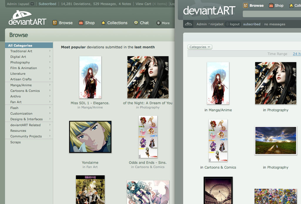
Introducing deviantART v6
This is the first ever published glimpse at v6, but this post is entirely technical in nature. For those in the community interested in the design process, this is for you. For those who want the whiz bang of getting going using the interface; wait a week.")
To start, please take a close look at where we started with this concept: [link]
v6 vs v5
This specific mock shows off mostly the old [link] environment, which has now become the front page of deviantART. Also merged in to the front page is Search in its entirety.
 Every search can be narrowed by category using the interface. Search for term "fish" and then click "Digital Art" and you'll obviously see fish in digital art. Zoom in and out of time ranges, all of it works without reloads (ajax) and very very quickly.
Thumbnails are further up on the page to start, you'll notice post bug-testing that the "Browse" bar, that's a bit thick right now will be thinned so thumbs can be even farther up.
LESS HORIZONTAL LINES! One of the biggest mistakes we made with v5 was actually one of the things we thought we did a good job with; REMOVING LINES! Lines really interrupt your brain when viewing an interface, the more of them there are the more stressful the interface. Note in v6 how many horizontal lines have been removed!!
Status indicator has been added to browse, this way you always know what you're looking at! Specifically in this shot: Most Popular deviations submitted in the Last Month --
User Bar has been moved to the TOP! This is becoming an internet standard, but there's a good reason for that. The flow of the page increased dramatically when we began testing this; and it also permitted us to have just ONE search box instead of one up top and one in the content.
OF COURSE! Taxonomy has been exposed! It's no longer hidden in the "category" drop down! This general layout helps us to begin moving in the direction of a considerably more powerful guided search for deviantART. Stay tuned for that.
Lastly, title of deviation has been added underneath thumbnails. We liked this extra bit of personality this adds to each piece; after all the title of a work often times has a real impact on the interpretation. We're still debating if we should keep this, what do you think?
This is the first ever published glimpse at v6, but this post is entirely technical in nature. For those in the community interested in the design process, this is for you. For those who want the whiz bang of getting going using the interface; wait a week.
To start, please take a close look at where we started with this concept: [link]
v6 vs v5
This specific mock shows off mostly the old [link] environment, which has now become the front page of deviantART. Also merged in to the front page is Search in its entirety.
Image size
1071x726px 470.09 KB
© 2008 - 2024 spyed
Comments5
Join the community to add your comment. Already a deviant? Log In
Looks very slick.. great interface. There's only one thing I'd change: The browse, shop etc-bar list isn't in line with the browse section beneath it. That "bar" should be more to the right, so it's in line with the line that separates the browse list (left) and the actual thumbnails. It's just a minor thing, and i don't know how to explain it well (don't feel like opening PS now xD), but it just "bugs" me
Anyway, great design & new features! Is there a release date yet, for us non-beta-tester-noobies? (Wink)")
Anyway, great design & new features! Is there a release date yet, for us non-beta-tester-noobies?